July’s Maintenance Technology magazine featured an article by Jane Alexander on the four essential elements of the Human-Machine Interface (HMI): 1) focus on your KPIs; 2) display meaningful data; 3) declutter alarms; 4) provide actionable information.
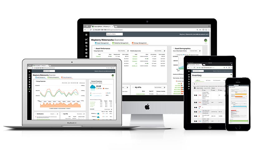
Our recent redesign of Motors@Work’s user experience relied on similar principles. This blog describes the four principles guiding the redevelopment of Motors@Work’s user interface.
- Fit information on a single screen.
As an engineer who spends a lot of time communicating technical information to a variety of audiences, I follow the work of information-design thought-leaders Edward Tufte and Stephen Few.
In his white paper, “Common Pitfalls in Dashboard Design,” Few defines a dashboard as “a visual display of the most important information needed to achieve one or more objectives, consolidated and arranged onto a single screen so the information can be monitored at a glance.”
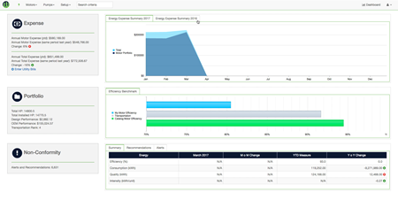
Establishing the constraint that each dashboard must fit onto a single screen forced us to revisit each of our design personas, deeply consider their strategic objectives, and reexamine their particular use cases. Ultimately, this led us to develop three dashboards — asset, reliability, & energy views — with each focusing on a different user and use case.
- Present actionable information supporting role-related objectives.
In his 1967 article “The manager and the moron,” Peter Drucker advised:
The question one must ask is not “How many figures can I get?” but “What figures do I need? In what form? When? And how? What are the thinking tasks that the display is supposed to help with?”
These questions — especially the last one — guided our decisions on what information made the cut for each of the three dashboards. Come back in future weeks for a deep dive on how each of our three dashboards provides specific users with meaningful information to help them achieve their role-related objectives.
- Streamline the information hierarchy.
We also considered Peter Drucker’s challenge: “Where are there opportunities to streamline and flatten the information hierarchy?” Or, as we applied it to multiple elements of Motors@Work’s user experience redesign:
- Does the user need this information on their dashboard?
- What is the most logical navigation to this feature?
- Where can we combine data and analyses to provide value-added information?
- Increase information density & improve comprehension.
Drucker notes, “Psychology tells us that the one sure way to shut off all perception is to flood the senses with stimuli. That’s why the manager with reams of computer output on his desk is hopelessly uninformed…”
The overly simplified, cartoonish website is a personal pet-peeve of mine. Like Few and Tufte, I strive to get as much insight out of each glance as possible. So, how could we increase information density without flooding users’ senses? The answer: good design.
This Edward Tufte lecture describes the relationship between information, clutter, and design:
To clarify, add detail. Clutter and overload are not attributes of information; they are failures of design. If the information is in chaos, don’t throw out information — fix the design. Simplify the design, intensify the content.
Adding detail forced us to think about how to best display each piece of information, how to minimize what Tufte calls “administrative debris,” and what context our users need to comprehend the data displayed.
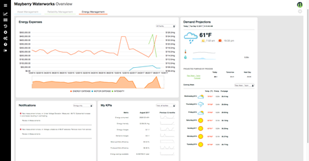
For example, take My KPIs: On the old Motors@Work dashboard, we used simple increase/decrease indicators in the Expense and Summary portlets to show the change from the previous month. Considering this objective lead us to consolidate indicators into the My KPIs portlet, add several new indicators that users requested, and show sparklines, which display that KPI’s values over the past 12 months. These sparklines, in a glance, provide insight into whether your organization is achieving a sustained change in the desired direction — increasing information density and providing useful context information compared to the former increase/decrease icon.
 |
 |
Did we achieve our interface redesign objectives? Judge for yourself. Email Nicole at info@motorsatwork.com to schedule your Motors@Work demo today.